 |
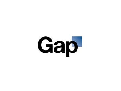
| The logo we're used to |
 |
| The new piece of hipster trash |
I personally like the old one much better, and I never liked it that much to begin with. To make matters worse, a website hosted a redesign contest, showing how much better their logo could have been.
Check out the entries at http://blog.iso50.com/20224/gap-redesign-contest/ but be warned, there are a lot of them. Some of them are very good, I like 51 and 55, others are complete ass, see 75.

The redesigned one looks like a computer software logo
ReplyDeleteNot sure I would have gotten rid of the iconic logo for that. Why not improve the quality of clothes instead?
ReplyDeleteAgreed. The New/old logo is hideous. Like 90's Microsoft or something. Yuck!
ReplyDeleteboth of them are incredibly plain. The old one is cosmically shitty though
ReplyDeleteRather than a complete overhaul, it could have been refined, keeping the similarity to the old while adding something fresh for the new.
ReplyDeleteNew one sucks.
ReplyDeletelol hipster fail
ReplyDeleteThe new logo looked like a crappy accountancy firm.
ReplyDeleteThe new one looks like three minutes in mspaint tops. Gosh.
ReplyDeleteFollowing and supporting!
Caps lock is old school apparently =\
ReplyDeleteFollowing and Supporting
http://ultimaniacsotakublog.blogspot.com/
They should make one using Comic Sans
ReplyDelete....wow. LOL. the logo contest site has some interesting ones.
ReplyDeleteforkfantasy.blogspot.com